
Butter&Batch
Butter&Batch
Brand Identity
Brand Strategy
Print Media
Nov 25
Butter&Batch is a small-batch bakery specialising in high-quality seasonal bakes crafted with irresistible ingredients, delivered straight to your door.
The client approached the studio to create a brand identity that felt both playful and professional, something that captured the indulgent nature of their products while providing a cohesive foundation for packaging, digital content, and in-person touchpoints.
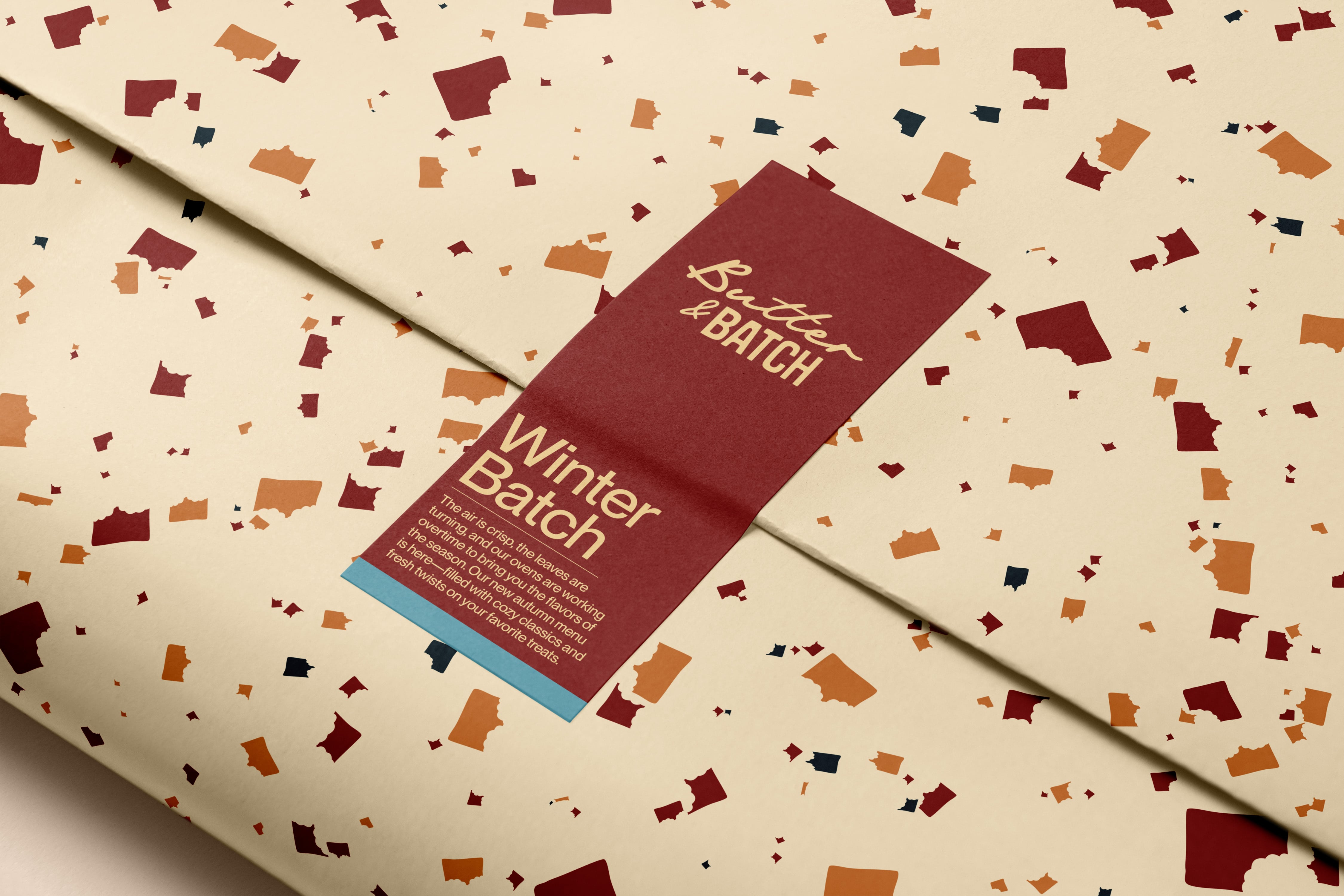
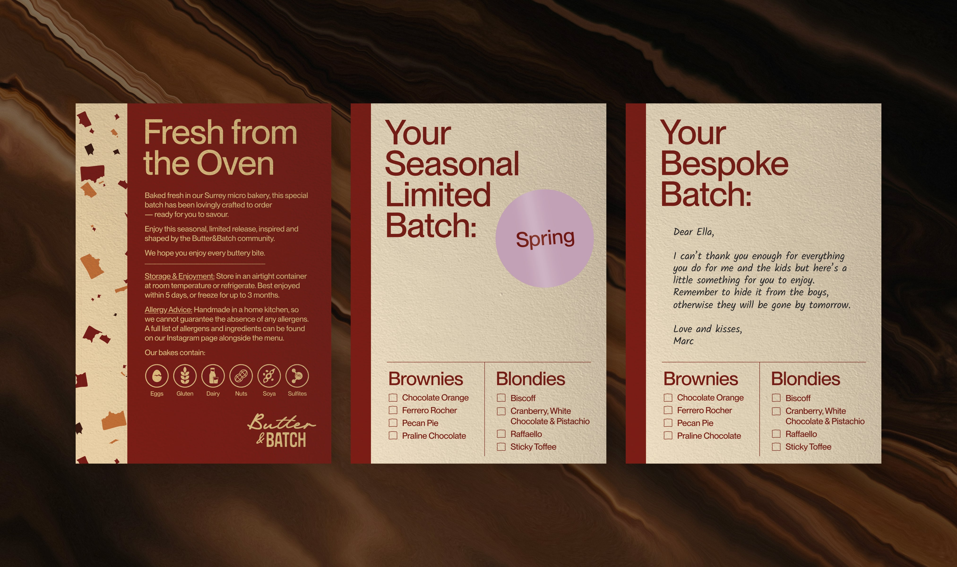
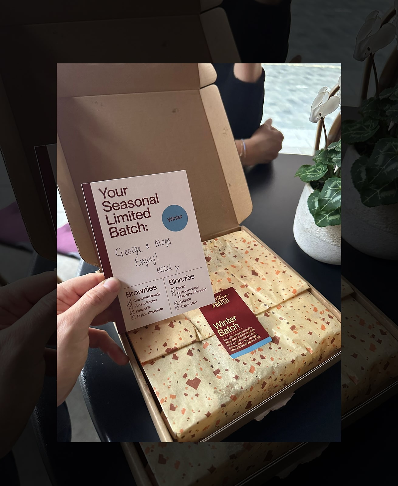
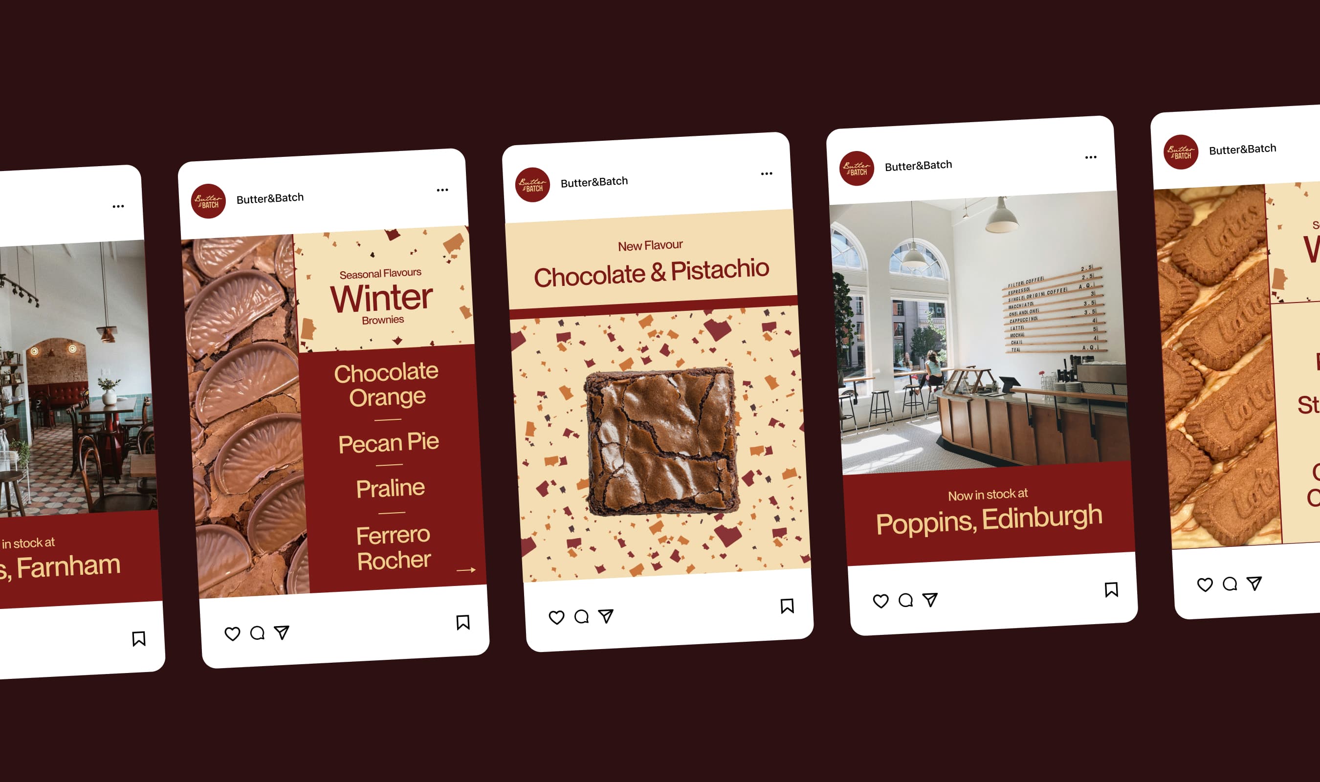
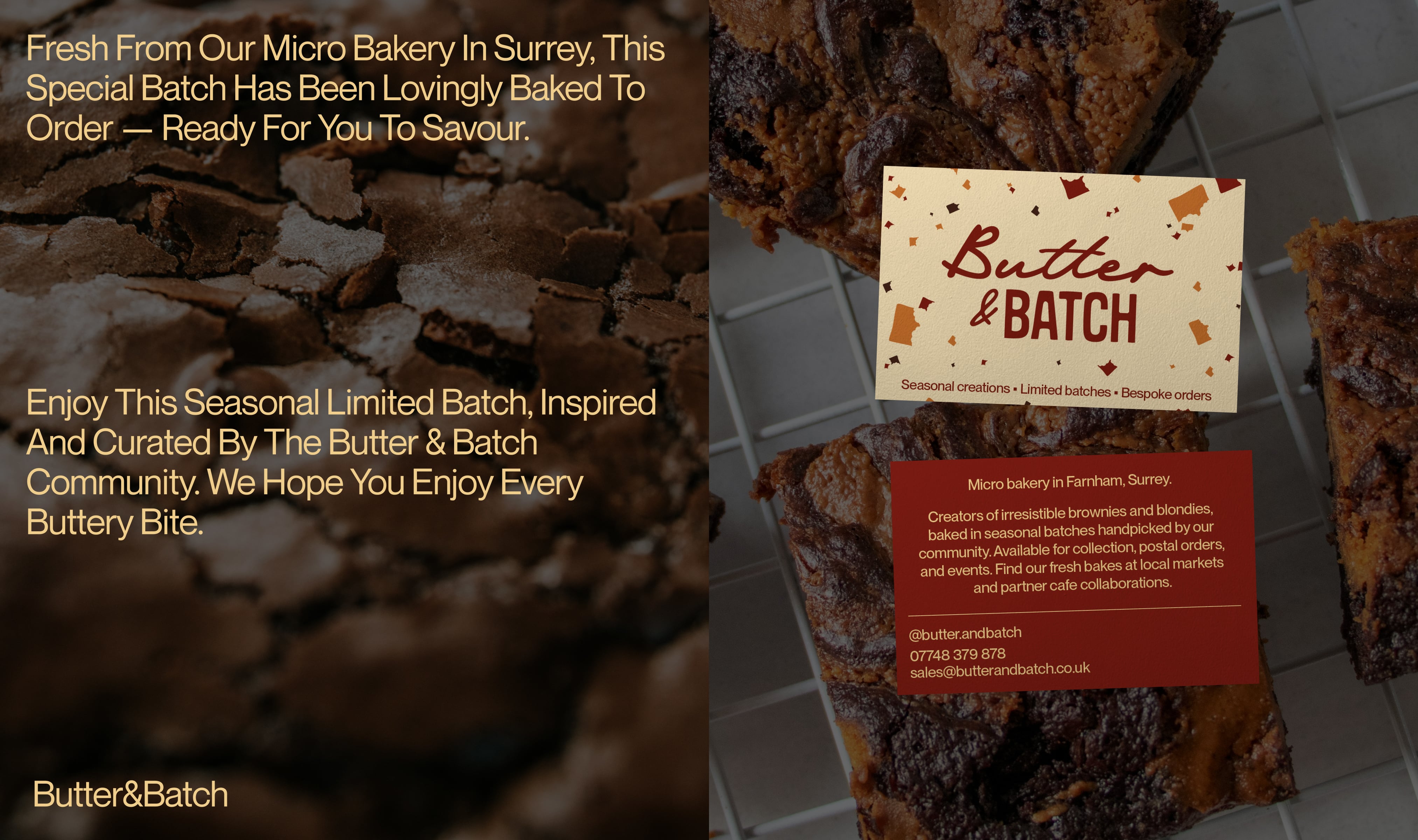
The Butter&Batch identity centers on a logo mark that blends the flowing texture of butter with the structured form of a brownie batch, creating an approachable and dependable mark. The colour palette draws directly from the products—creamy butter tones and rich brownie shades—with a complementary four-tone seasonal palette for year-round flexibility.
A distinctive terrazzo pattern made from brownie bites serves as a recognisable signature across packaging and digital assets. Since the client would manage the brand independently, the system was designed for ease of use in Adobe Affinity, allowing for seasonal updates while maintaining visual recognisability and consistency.
Butter&Batch is a small-batch bakery specialising in high-quality seasonal bakes crafted with irresistible ingredients, delivered straight to your door.
The client approached the studio to create a brand identity that felt both playful and professional, something that captured the indulgent nature of their products while providing a cohesive foundation for packaging, digital content, and in-person touchpoints.
The Butter&Batch identity centers on a logo mark that blends the flowing texture of butter with the structured form of a brownie batch, creating an approachable and dependable mark. The colour palette draws directly from the products—creamy butter tones and rich brownie shades—with a complementary four-tone seasonal palette for year-round flexibility.
A distinctive terrazzo pattern made from brownie bites serves as a recognisable signature across packaging and digital assets. Since the client would manage the brand independently, the system was designed for ease of use in Adobe Affinity, allowing for seasonal updates while maintaining visual recognisability and consistency.
If you are interested to hear more or just fancy a chat, please reach out to me at: hello@camkelly.xyz
If you are interested to hear more or just fancy a chat, please reach out to me at: hello@camkelly.xyz
If you are interested to hear more or just fancy a chat, please reach out to me at: hello@camkelly.xyz
©camkelly2025


©camkelly2025